
The Builders of the Book: Paper Trail
6 Nov 2023

Mark Chalmers dips into the archives to observe the manner in which practices present and record their work evolved, more than just a tale of brochures being replaced by websites recent decades show that record keeping has become more ghostly than ever.
Mention paper architecture and you might picture the Zagreb Free Zone scheme by Lebbeus Woods, competition entries by Vesnin and Melnikov from the early years of the Soviet Union, or Zaha Hadid’s paintings of The Peak in Hong Kong. Paper architecture consists of visionary designs which are exhibited and published, but rarely built.
But there’s a second kind of paper architecture: the brochures, pamphlets and books which practices use to promote themselves. As with architecture magazines, they provide a contemporary version of events: but from the eye witness view of the architect, rather than a secondhand account by a journalist. When did architects begin publishing? The Adam Brothers published their Works in Architecture in the 1770’s: a series of five volumes which were bankrolled by wealthy subscribers, but our modern role model is Lazar Markovich Lissitzky, who was born near Smolensk in 1890 and trained as an architect at Darmstadt. El Lissitzky listed his activities in the following order: engineer-architect, painter, photographer, and typographer – but soon after he returned to his native Russia, the 1917 Revolution broke out.
There were few opportunities to build, so he devoted himself to what he called book building. In 1831, Victor Hugo claimed that Gutenburg’s invention of movable type had displaced architecture as the universal form of popular expression. “Architecture was the principal writing, the universal writing,” Hugo wrote in The Hunchback of Notre Dame, but “the Book will destroy the Edifice.” El Lissitzky took revenge on behalf of architects by expanding his activities to include the design of books, posters and graphics. Until the birth of Modernism, writers paid little attention to typography. Except for Laurence Sterne in his novel Tristram Shandy, they were more interested in what the words said rather than how they looked. But architects are a visual breed, so along with his colleague Alexander Rodchenko, El Lissitzky pioneered the use of photomontage and the abstraction of type into graphics. They became part of the Suprematist movement. Unwittingly, perhaps, every architect who designs and publishes a book follows in El Lissitzky’s giant footsteps. Architectural publicity comes in several flavours. The first consists of monographs about already-famous architects, such as Mackintosh and Le Corbusier.
They’re usually commissioned by publishers which specialise in arts publishing, such as Lund Humphries, Phaidon and Thames & Hudson. Provided the architect is a household name, the book should sell in the thousands and make back its money. A second strain are books about less well-known subjects, which are often published to accompany exhibitions. They have a shorter print run and after selling a few hundred copies, they go out of print. Afterwards, they may become the definitive (and sometimes the only) record of an architect’s work: a good example is the monograph about Gillespie Kidd & Coia which The Lighthouse published 15 years ago. A third type consists of publications about active practices which are commissioned by the practices themselves. They typically approach a commercial publisher with a strong architecture list, such as Black Dog Publishing, and ask them to assist in putting a book together. In return, the practice makes a contribution to its costs. Best known are James Stirling’s White Book and Black Book, and the series of volumes which Ian Lambot at Watermark produced over the years to document Norman Foster’s output.
In Scotland, we had a couple of books produced on the tenth and twentieth anniversaries of Richard Murphy’s practice, and another notable pair about the work of Gordon Murray and Alan Dunlop as GM+AD Architects, which were published by Urban Realm’s former parent Carnyx in the 2000’s. At this point it’s worth acknowledging a difference between brochures and monographs. Brochures are promotional material, even if they’re written by a tame journalist or have a flattering introduction from a mentor. Edwin Heathcote, architectural critic of the Financial Times thought that, “Architects are like novelists. They regard the most important thing in their careers as being published. Buildings are all very well but they are somehow only truly complete when they have appeared in a glossy mag.”
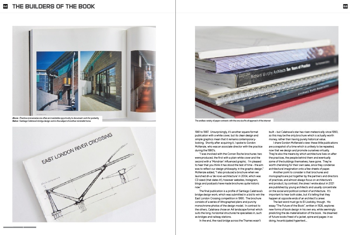
Heathcote believes that getting into print affirms and validates what architects do. Monographs are more likely to be taken seriously when they shade towards criticism and historiography; sometimes they grow out of PhD dissertations or research projects. Very occasionally, the first and third categories cross over when an architect becomes world-famous and their work is scrutinised by academics during their lifetime. The last category consists of brochures written, designed and published by architects themselves. El Lissitzky – and Le Corbusier, who was quick to recognise the potential of print for his manifestos – saw creating a publication as a creative exercise in itself. They envisaged words and pictures working together, and relished having control over everything: content, layout, editing, production, even the choice of paper stock. Outsiders to the scene view practice profiles differently. To the PR executive, they’re marketing collateral, to the bookdealer they’re ephemera. Bearing that in mind, I didn’t set out to collect practice brochures: I just gradually acquired them over time, usually by accident. They were included with a book I was given, or slipped inside something I bought online. That’s indiscriminate in a way that serious collecting would never be, but the field is small. You have to catch what you can.
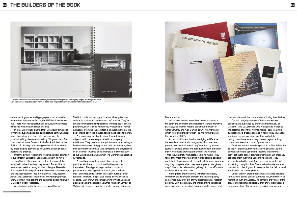
One of the first brochures I came across was a square format, wiro-bound booklet published in 1996 by RMJM to mark their 40th anniversary. Its contents are typical of the genre: arranged chronologically, they show the practice’s development over the decades through a series of key projects. Work from the early years includes Turnhouse Airport and Cockenzie Power Station, followed by the Royal Commonwealth Pool and Stirling University, then themes such as Global Thinking and Green Issues – which were prominent in RMJM’s design thinking even 25 years ago. With its square format and plain white cover, RMJM 40’s design betrays a subtle Suprematist influence, and the practice’s logo is superimposed on a white ground – just like Kazimir Malevich’s famous painting of the black square. Soon after, I came across a practice profile put together by the Parr Partnership: by coincidence, it was also produced in 1996, and also to mark that practice’s 40th anniversary.
There’s less philosophical reflection than in RMJM 40, but Parr’s brochure covers the practice’s major projects, including General Accident’s HQ in Perth, the original Scottish Exhibition Centre in Glasgow and a string of production plants in Silicon Glen. Subtle graphics help to establish the practice’s design credentials. The 1990’s was a brief golden age: powerful desktop publishing packages like QuarkXPress came onto the market, but the internet hadn’t yet made an impact. A decade before, practices either relied on a compositor to photoset type onto bromide prints, or carried out a DIY job using Letraset, typewriters and Cow Gum. A decade later, the brochure had de-materialised into a PDF file hosted on a website. I picked up a practice profile from Anthony Hunt Associates when we spoke to them about a still unbuilt (and possibly unbuildable) project in Aberdeen.
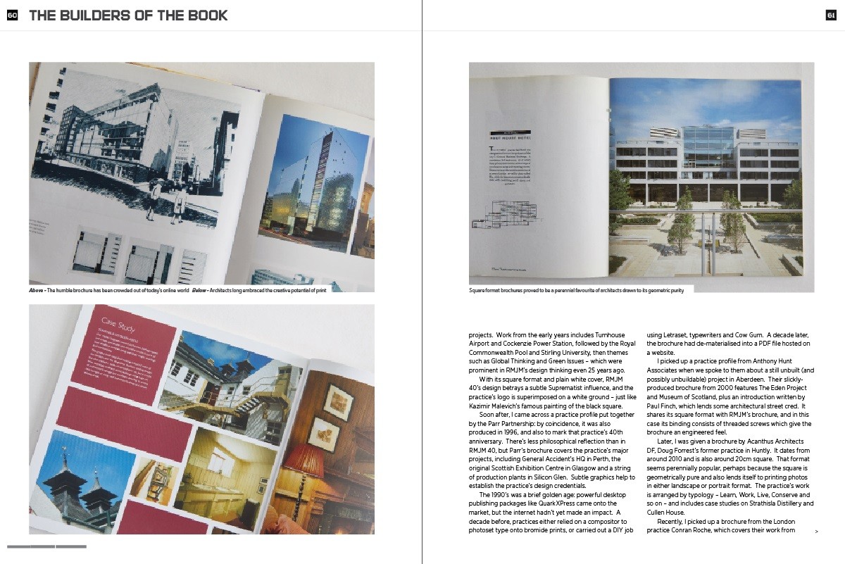
Their slickly-produced brochure from 2000 features The Eden Project and Museum of Scotland, plus an introduction written by Paul Finch, which lends some architectural street cred. It shares its square format with RMJM’s brochure, and in this case its binding consists of threaded screws which give the brochure an engineered feel. Later, I was given a brochure by Acanthus Architects DF, Doug Forrest’s former practice in Huntly. It dates from around 2010 and is also around 20cm square. That format seems perennially popular, perhaps because the square is geometrically pure and also lends itself to printing photos in either landscape or portrait format. The practice’s work is arranged by typology – Learn, Work, Live, Conserve and so on – and includes case studies on Strathisla Distillery and Cullen House. Recently, I picked up a brochure from the London practice Conran Roche, which covers their work from 1981 to 1987. Unsurprisingly, it’s another square format publication with a white cover, but its clean design and simple graphics mean that it remains contemporary-looking. Shortly after acquiring it, I spoke to Gordon McKenzie, who was an associate director with the practice during the 1980’s.
“I was involved with the Conran Roche brochures: two were produced, the first with a plain white cover and the second with a ‘Mondrian’ influenced graphic. I’m pleased to hear that you think it has stood the test of time - the aim was to reflect our design philosophy in the graphic design.” McKenzie added, “I also produced a brochure when we launched dn-a ‘de novo-architecture’ in 2004, which was CD sized (that dates it!), however websites, Instagram, blogs and podcasts have made brochures quite historic now.” The final publication is a profile of Santiago Calatrava’s bridge design work, which was submitted in a bid to win the East London Crossing competition in 1990. The brochure consists of a series of lithographed plans and punchy monochrome photos of the design model.
In contrast to the others, Calatrava chose an A4 landscape format which suits the long, horizontal structures he specialises in, such as bridges and railway stations. In the end, the road bridge across the Thames wasn’t built – but Calatrava’s star has risen meteorically since 1990, so this may be the only brochure which is actually worth money, rather than having purely historical value. I share Gordon McKenzie’s view: these little publications are a snapshot of a time which is unlikely to be repeated, now that we design and promote ourselves virtually. They’re also the means by which architecture lives on after the practices, the people behind them and eventually some of the buildings themselves, have gone.
They’re worth cherishing for their own sake, since they condense architectural imagination onto a few sheets of paper. Another point to consider is that brochures and monographs are put together by the partners and directors of practices, and almost always focus on architecture’s end product; by contrast, the zines I wrote about in 2021 are published by young architects and usually concentrate on the social and political context of architecture. It’s important to hear both sides, but it’s telling that they happen at opposite ends of an architect’s career. The last word must go to El Lissitzky, though. His essay “The Future of the Book”, written in 1926, explores new forms of book design in his own era, while seemingly predicting the de-materialisation of the book. He dreamed of future books freed of a jacket, spine and pages: in so doing, he anticipated hypertext…
|
Back to November 2023
