
Campus Central: Estate Renewal
21 Apr 2022

One of the most picturesque campuses in the country has always been a cut above the rest but a new front door promises to take it to a new level. We take a look at the latest addition to the University of Stirling to see what it says about the future of campus life. Photography by Paul Zanre.
The future of further education is being thrown into sharp relief by the switch to home learning and the University of Stirling has doubled down on its picturesque Airthrey Campus to retain the best aspects of an estate widely held to be among the best Modernist campuses in the country.
Built 60 years ago and subject to numerous unsympathetic alterations over the decades the university has now turned to Page\Park Architects to undertake more radical surgery to improve access and the learning environment for returning students and staff in a post-pandemic world. Urban Realm took a look at the wedge-plan ziggurat at the heart of campus life to find out how education provision is shaping up in the 21st century.
Campus Central is more than a simple front door. It encompasses a refurbished atrium and pedestrianised forecourt that together are more than the sum of their parts. Inspired by the geography of the Carse of Stirling the project revitalises the library and MacRobert Arts Centre by framing the pedestrianised Queens Court, a generous piece of public realm formed by the relocation of a bus terminus.
Site constraints mandated a fully accessible triangular extension that responds to adjacent late-Modernist buildings and a high-pressure water main crossing Queen’s Court to establish a new front door to the MacRobert Arts Centre. Separately, a glazed atrium created in the late 1990s has been fully refurbished to make better use of the original steel-frame structure and to open up the volume, improve ventilation and maximise views and light across Airthrey Loch to the Ochil Hills. Further interventions led to the removal of glazed screen shopfronts in favour of retractable shutters and an enlarged cafe.
Detailing the resulting fusion of geography and geometry, Finbarr O’Dempsey of Page\Park architects, told Urban Realm: “The project emerged from 10 years of alternative projects to redevelop the atrium within a wider sustainable master plan. We were well aware of the spectacular landscape setting and the weight of RMJM’s original masterplan, everything we did was in keeping with the spirit of this plan. The original competition team were reluctant to plan anything for the site because it was so beautiful, to begin with.”
You’ve likened the intervention to a river valley, how did you pick up on natural features and how were these translated into architecture? O’Dempsey said: “The campus is planned around an artificial loch that was dug out in the 18th century as the setting for Airthrey Castle estate by Robert Adam. There’s a clear and powerful landscape horizon on all sides below the looming Wallace Monument. You’re always aware that you are at the bottom of a valley. That’s translated to distinctive voids within the building, the central staircase and what we call the slot stair below the new roof light at the junction with the library. We reinterpreted the spatial qualities of those geological features.”
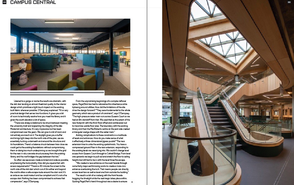
Likened to a gorge or ravine the results are dramatic, with the slot stair lending an almost theatrical quality to the interior design which prioritises a light touch impact on the existing built fabric wherever possible. O’Dempsey explained: “It’s a very practical design that serves two functions. It gives you a bit of room to technically resolve how you meet the library and it gives the south elevation a bit of space.
“There was always a balance to be struck between meeting the university brief and respecting the integrity of the late Modernist architecture. It’s very impressive but has been compromised over the years. We can give it a bit of room and not entirely encroach on it. The skylight gives you a buffer and brings light deep into the north side of the plan, we are essentially tucking underneath and around the structure and its foundations. There’s a balance struck between how close we could get to the existing foundations without compromising them or doing too much underpinning so we brought the grid for the new in-situ concrete structure away from the existing library and the roof bridges the gap between the two.”
So often we see access made as broad and wide as possible, emphasising the horizontality. How did you square that with access requirements? “There’s a 30-minute fire screen to the north side of the slot stair which runs 4.5m either end beyond the void to allow a safe escape route around the stair void. It’s as wide as we could make it and be compliant and it’s not a fire escape stair. Nothing has been compromised to achieve that compression”, says O’Dempsey.
From the unpromising beginnings of a complex leftover space, Page\Park has had to rationalise this inheritance while tiptoeing around utilities. How did the limitations of the site drive the design forward? “They were fundamental to the whole geometry which was a product of constraint”, says O’Dempsey. “The high-pressure water main runs across Queens Court so we had an 8m standoff from that. We used that as the extent of the new footprint with the third-floor offset and cantilevered out to maximise usable floor area. The boundary with the existing library and then the MacRoberts centre on the east side created a triangular wedge shape with the water main.”
Adding complications to these constraints is a multitude of levels and entrances. How do you make sense of what is effectively a three-dimensional jigsaw puzzle? “The new extension tries to untie the existing spatial knots. You have a compressed ground floor in the new extension, responding to the existing levels we were tying into. We couldn’t change level access from Queens Court through to Cottrell Bridge. From level one upwards we begin to pull out and stretch the floor to ceiling heights but still had to tie in with the level three fire escape.
“We created a new entrance on the west facade through some fairly major earthmoving works to create a more civic entrance overlooking the loch. That means people can directly access level two as well as level one from outside the building.”
The result is a bit of an iceberg with the front facade hogging the limelight while the real magic takes place within. Guiding Page\Park’s hand throughout was a desire to ensure greater longevity of the existing structure while making minimal interventions of their own. “There is so much embodied carbon”, says O’Dempsey. “Although it was less than ideal it was well used and an important setting for generations of students and staff. There was originally an open courtyard garden where there is now a glazed atrium. It was only in the nineties that they put in a roof light, turning an external space into a fully internal one.
“We were trying to restore the spirit of the room at the heart of the space. We’ve restored the garden setting albeit internalised and retained over 90% of the existing structure.”
Wearing its engineering on its sleeve with an exposed concrete skeleton on full display the extension makes a statement as the modern face of the campus, building upon the material language of aggregated pre-cast from the late-sixties, portions of which have been replaced by powder-coated panels as at the Cottrell Building. “It borrows heavily in terms of the expressed structure”, maintains O’Dempsey. “We’ve got an in-situ concrete frame which we worked hard to distinguish from the library concrete, it’s a lighter mix. It’s not ideal in terms of the embodied carbon but we worked with the structural engineers to reduce the cement content and sourced aggregate locally, principally dolomite from the Northfield Quarry in Falkirk and sand from Angus near Alloa. A fair bit of thought has gone into how the formwork responds to the overall diagrid to accentuate the triangular geometry.”
More natural materials can be found in the roofscape which makes extensive use of glulam timber, in a nod to the woodland setting: “It’s a bit of a tired analogy but it’s tying into the tree canopy of Queens Court”, says O’Dempsey. “Branching column heads have capping plate details which tie the beams together. Internal beams are fixed to the side of the main beams with his and hers bracket that tucks into the side of the main beams. We had to negotiate charring depths for all the exposed glulam and it was treated with flame retardant to achieve the 60-minute maximum fire rating. Above the glulam, we’ve got a 100mm cross-laminated timber deck that extends out along the south elevation to deal with the cantilever and take the head of the curtain walling and reduce the overall depth. Unfortunately, it’s still under quite a thick band.”
Beyond the architecture, it is the landscape that defines the setting, now newly enhanced at the hands of Raeburn Farquarbowen, (formerly Ian White Associates). “The idea of turning the roundabout and bus station into a new gathering space at the heart of the university is fundamental to the success of the building and is in many ways even more transformational than the building itself. There’s a radial splay to the landscaping in response to the south elevation. We’re lucky to inherit so many mature trees, the building benefits from the semi-mature landscape that it’s grounded in. It feels nested into the campus. It’s very different to the bomb site you often get when starting carte blanche.”
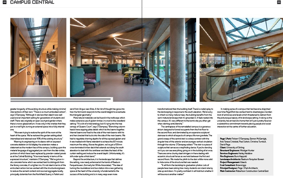
The centrepiece of the remodelled campus is a generous atrium designed to funnel occupants from the first floor to the second floor, and dominated by an expansive sculptural staircase to which all aspects of campus life now gravitate. The grand sweep of the central stair is a sharp contrast with the angular lines of the exterior and encourages vertical circulation through the volume. O’Dempsey added: “The stair is a piece of sculpture that serves as a wayfinding device. If you’re standing on it you can see everything going on in the building all at once. There are some chunky steel stringers in there dealing with eccentric structural forces as we twist between the first and second floors. We made the plinth to the stair a little more solid to hide some of the structure that was needed.
“It will form the backdrop to graduation photos. Lots of people have been asking how many students can stand side by side up and down. I’m pretty confident it will hold but whether it will bounce is another matter!”
In making sense of a campus that had become disjointed over time Page\Park has worked hard to disentangle a Gordian knot of entrances and levels which threatened to detract from the picturesque beauty of its landscape setting. In doing so the university has arrived at a home that isn’t just a pretty face but a substantive commitment towards placing people and social interaction at the centre of further education.

|
Back to April 2022
