
Simple geometry
6 Apr 2006
Jens Bergmark reviews a new mews house in Edinburgh designed by Andrew Stoane which, he says , represents a radical departure for its developer client and a potential model for a variety of sites. Photography by John Reiach.
It is a truth universally acknowledged that few other building types demand more design flair and competence from the architect than a house. The complex functions of the dwelling have to be squeezed into a relatively small area and at the same time there is a need to fulfil each space’s requirements for light, openness, shelter and materiality. The potential for the architect to demonstrate his knowledge and express his design philosophy in a small and compact plan is therefore greater in the small house than anywhere else. The creation of a house made of interwoven spaces carved out of a perfect cube – the modernists’ ‘prisme pure’ – is also a traditional, much loved, but now perhaps a bit forgotten, pastime of architects.
It is therefore with a profound sense of satisfaction I find myself placing Andy Stoane as one in a long line of architect-houseplanners after, on a sunny autumn evening, I had the pleasure of visiting his latest oeuvre in Edinburgh’s Upper Gilmour Place. This house inevitably brings one back to the great modernists and, with its cube-like proportions, it almost becomes a slightly squeezed variant of Le Corbusier’s Pavillon de l’Esprit Nouveau. No surprise then that the architect is dedicated to the study of the early modernists and that he finds it almost impossible not to constantly refer back to Le Corbusier and, even more so, Mies van der Rohe.
This three-bedroomed house has been a long-awaited opportunity to realise a complete new-build project for Stoane who, since setting up his own practice straight after leaving university in 1992, has had to be content with a string of small conversions alongside a lengthy list of unbuilt competition entries. Clearly these smaller and unbuilt projects have not been a wasted effort; the completed house at Upper Gilmour Place represents an extremely competent design as well as a radical departure for its developer client.
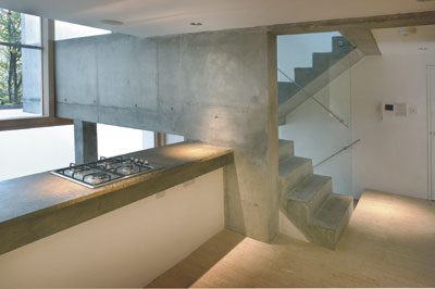
The house occupies a narrow rectangular plot contained by buildings on both sides and by neighbours’ gardens to the rear. Planning regulations concerning overlooking, overshadowing and privacy prohibited outward views from anywhere other than the small front façade. Conceptually, this restriction has prompted a design where site and house became fused into one entity – the very opposite of the house as a box sitting in the middle of its site. Instead, within the overall enclosure, there is a continual physical and visual dialogue between inside and outside. Internal and external spaces are treated as the same, with identical materials and characteristics. In a way, the house can be read simply as a series of contained interrelated ‘rooms’, some of which are without ceilings. The upward views in these ceilingless ‘rooms’ take in the sky, trees, rooftops and a nearby church gable.
This spatial concept allows the house to make two quite fundamental suggestions, which together are much bigger than the project itself. Firstly, the house challenges the convention of new-build speculative housing. The site is awkward and has a history of failed planning applications using more conventional approaches to the site. In this case the use of architecture, to its full potential, solves these problems and allows the site to be developed.
Secondly, the house is, in volume, an average family house and it has been put on a very small urban plot. While the house offers the complete antithesis of the suburbs, it still contains all the elements that make suburban living attractive – light, shelter, privacy, external space and nature. Yet, here, there is an awareness of the surrounding city, instead of the anonymity of the suburbs. It would be easy to imagine building a whole series of these houses, densely packed together, suggesting a more ecological way of living than the conventional family house.
An existing step in the site allows rooms to be planned over four half levels, all grouped in a spiral movement around a five-metre-high living space to the rear of the site. The main public spaces, in essence, take the form of large landings off the central stair, all visually communicating with each other and each being a separate part of a bigger whole. The entrance level contains service accommodation and kitchen with the living space half a level down and the dining space half a level up. The bedrooms are situated on the more private top level of the house. Materially, boundary walls are treated as neutral backdrops, plastered and painted white, thus allowing the central in-situ concrete spine wall and stair to define movement through the house. Glass screens are framed with Douglas fir, except in the dining area where the glass is seamlessly raggled into the concrete. Flooring is travertine to the entrance level, southern yellow pine to other public areas and to the external spaces. Roofs are plain felt with projecting nosings, detailed to show no eaves trim, flashings or rainwater goods. The front elevation is expressed as a simple portal with two recessed bays, one for parking, the other for the entrance. There are no facings, beads or skirtings. All materials are very carefully chosen, used ‘as found’ and meet openly with all joints clearly shown. All the necessary evils, such as light fittings, sockets and taps, are positioned with such precision that they become ornaments in their own right – the fire escape from the first-floor balcony gracefully sweeps over the balustrade like the ladder into a swimming pool and the Belfast sink becomes a piece of art, like Duchamp’s urinal.
The result of all this is a truly remarkable building. It is utterly controlled in everything from concept to detail and yet there is something entirely effortless about it. The architect is extremely serious about how to choose his materials, how to make them meet, how to dissolve inside and outside and sometimes, according to himself, his firm principles and methodologies verge on the obsessive. And somehow, inexplicably, the house is joyful, light and absolutely relaxed. It skilfully avoids the usual preoccupation with fanciful detailing and effortful effect-searching. It shows that invention does not need to be complicated and that tried and tested materials and compositions can provide the most imaginative results.
The house that now graces Upper Gilmour Place is a very mature piece of work, worthy of someone well beyond its architect’s years. This building is more architecture than design and as I leave, I can almost hear Mies repeating his dictum of ‘less is more’ to me.
Read next: Thorny issues on the waterfront
Read previous: City Halls
Back to April 2006
Browse Features Archive
Search
News
For more news from the industry visit our News section.

Features & Reports
For more information from the industry visit our Features & Reports section.