Fresh details published for speculative 85,000sq/ft Glasgow office block
December 9 2015
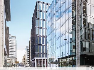
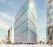
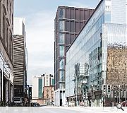
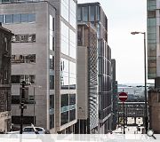
Further details have emerged of a speculative office redevelopment in central Glasgow planned by Patrizia and their architects Keppie Design.This will see the existing Douglas House replaced with 85,000sq/ft of grade A office space in a 15 storey block finished in dark grey and white precast concrete, anodised aluminium and clear glass.
Featuring a colonnade along Waterloo Street the scheme will include new paving to the west as well as a setback entrance.
In their design statement Keppie observed: “The building mass is separated into three distinct elements by emphasising the datum at key heights. The base relates to the human scale at ground level and helps the building to negotiate the steep topography of Douglas Street. The middle section represents the bulk of the office floors and identifies the commercial nature of the building in mid-range views. The top relates to the heights of neighbouring buildings and helps to reduce the massing at the upper floors.”
|
|
10 Comments
#1 Posted by The flâneur on 9 Dec 2015 at 13:24 PM
Perhaps Urban Realm would be so kind as to clarify which aesthetic was approved? Is it the aesthetic in image 2 or the aesthetic in the remaining images? On the basis of the previous visual and a reference to a colonnade I’m assuming the later. Also, as I recall from the GUDP report, which is available with the application documents online, I don't think the panel criticised it for being 'too trendy' rather they were universally astonished when the presenter sought to compare the design to the Seagram Building. GUDP then went on to recommend refusal as they thought the proposal under-developed at that stage and lacked the analysis required to justify such an increase in size.
#2 Posted by David on 9 Dec 2015 at 15:06 PM
I think this updated proposal is a significant improvement, however there are still aspects of it I feel are a bit clumsy and unresolved.
The architect has decided to emphasise the lower 2 floors in a light coloured colonade, which works well, but seems to be missing a leg at the north west corner.
Again the upper floors are expressed on double floors, however floor 3 seems at odds with everything else as it is expressed as a single storey.
Dealing with these 2 issues I feel would make a big improvement.
Someone needs to explain where the 'too trendy' claim comes from. UR?
#3 Posted by Urban Realm on 9 Dec 2015 at 15:07 PM
All images are of the approved scheme excepting the one captioned '...pre-appliaction proposals.' The 'trendy' comment refers to a summation of the GUDP report on pg 35 of the design statement (section 05) via the first link provided.
#4 Posted by The flâneur on 9 Dec 2015 at 16:58 PM
Thanks for clarifying UR. I’ve now spotted the reference to ‘trendy’ in the architect’s design statement so can see where it came from. However, that is the architects’ summation of what they think GUDP is saying though technically it is the GUDP report that is the official record of any discussion. From that it appears that GUDP were looking for a facade treatment that reflected the ‘depth of visual history and the richness’ of the buildings in the Central Conservation area. I appreciate that as a result of that discussion the design has altered significantly from what was originally proposed towards what the architects describe as a more traditional load bearing façade, but I don’t think it possible to square the more expressive and contextual aesthetic GUDP thinks would serve the city better with the unashamedly restrained aesthetic the architects want.
#5 Posted by Billy on 9 Dec 2015 at 18:39 PM
In a city known for grey skies can we stop throwing up buildings that are grey black or reflect grey skies. Can someone not be bold and put some colour in our lives. The financial district is one boring depressing area with the exception of the older building. Give us a break from grey and dull.
#6 Posted by Neil C on 9 Dec 2015 at 20:45 PM
Billy, the images feature alongside two of the most striking buildings in the financial services district. The Sentinel Building and the Bacofoil Building, hardly boring, whether you like them or not
#7 Posted by D to the R on 9 Dec 2015 at 22:02 PM
Sadly speculative means naebody to move into it which will absolutely mean another empty ground floor retail unit in the city. These building make zero contribution to the city as a whole .... St Vincent St Plaza - decent public realm works with almost no-one using it
#8 Posted by John on 10 Dec 2015 at 13:14 PM
I can't get enough of that big blank façade on the third image. Quality job Keppie...
#9 Posted by pleasantfield on 10 Dec 2015 at 13:28 PM
Why oh why does everything have to be an unrelieved rectangular box. Is their no ability to articulate or step facades anymore.
Yawn yawn
Yawn yawn
#10 Posted by QMD on 10 Dec 2015 at 14:37 PM
I just wonder, while we moan about the design on UR, the developers/architects are going to proceed anyway with what generates the most revenue for them. Who cares...
Post your comments
Read previous: New Royal High School hotel images published
Back to December 2015
Like us on Facebook
Become a fan and share
News Archive
Search News
Features & Reports
For more information from the industry visit our Features & Reports section.


