Scottish Opera unveil Theatre Royal extension
February 2 2015
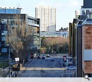
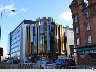
The latest addition to Glasgow’s streetscape has injected some fresh vitality to the northern end of Hope Street with the completion of a structurally expressive extension to the Theatre Royal.Developed by Page\Park Architects on behalf of Scottish Opera the drum-shaped addition wraps around a double cantilever enclosing a custom built spiral staircase which rises through the full height of the interior.
More than just a pretty face this façade incorporates a ventilation system, freeing up the ceiling, to open up interior spaces in a hi-tech take on Richard Rogers work on the Pompidou Centre. Jamie Hamilton, Page\Park’s depute of creative workspace, told Urban Realm:
“The fins on each of the structural bays and intermediate bays are hollow with grilles at the base to draw air up and through via a motorised louver and the stack effect.
“There is also a heater hidden inside and they double as a drinks booth to observe the street. You make the most of the space because you’re not hiding anything in the ceiling.”
A full review of the new-look Theatre will appear in the Spring edition of Urban Realm.

Theatre goers can take advantage of a rooftop terrace to soak in skyline views during refreshment breaks
|
23 Comments
#2 Posted by Sir Ano on 2 Feb 2015 at 12:18 PM
Seriously David !?
#3 Posted by Art Vandelay on 2 Feb 2015 at 13:17 PM
Don't know why, but I get distinct flashbacks to the Sauchiehall Centre, c. 1987, must be the gold cladding. The staircase is quite impressive, but seems a lot of effort just to get a nice view out over Townhead...
#4 Posted by Rem Koolbag on 2 Feb 2015 at 14:15 PM
It's an odd building, at first glance, and I really wasn't sure of it when the visualisations came along, but bloody hell it looks good!
The staircase inside looks fantastic from a glimpse. The gold.....things...round the perimeter are actually beautiful and the marriage between new and old seems to work quite well too. Would even consider buying a ticket to the theatre just to see inside. Do they do a panto?
The staircase inside looks fantastic from a glimpse. The gold.....things...round the perimeter are actually beautiful and the marriage between new and old seems to work quite well too. Would even consider buying a ticket to the theatre just to see inside. Do they do a panto?
#5 Posted by james on 2 Feb 2015 at 16:26 PM
Well, at least it's contemporary (as in no one knows what an ipad's for anymore contemporary) and to be perfectly honest with you, to tell you the truth, I never knew what it was for in the first place. By the way - is thatno Sauron's gaff? But then again, clearly, I have no discerning taste.
#6 Posted by Big dog on 2 Feb 2015 at 17:45 PM
Not sure Glasgow got value for money on this one
Feel shot changed on a number of levels
Feel shot changed on a number of levels
#7 Posted by Rem Koolbag on 3 Feb 2015 at 09:08 AM
Can you elaborate on what you mean by Glasgow not getting value for money Big Dog? Genuinely interested in the concept of a city getting value for money out of a building and the perceptions of such.
#8 Posted by David on 3 Feb 2015 at 10:24 AM
Sir Ano, yes seriously.
You seem surprised that someone doesn't like it?
If you want me to elaborate I would admit that there are some elements of it I like, for instance the polished concrete is excellent and there are some nice little details here and there, but the overall massing and up down repeating fin pattern of the main drum element I find particularly clumsy.
Opportunity missed in my opinion to provide a world class addition to the most high profile theatre in Glasow.
#9 Posted by Andrew Lee on 3 Feb 2015 at 16:40 PM
Anyone attempting to evaluate this building on the basis of this bizarre set of photographs would be understandably underwhelmed. I have been on site for several weeks taking photographs (soon to be published) and the client and public reaction has been overwhelmingly positive. My advice would be to pop along for a coffee and see it first-hand
#10 Posted by D to the R on 3 Feb 2015 at 20:10 PM
#David ... Go and see it - I mean inside. I won't define 'world class' but the attention to detail, execution of an idea and clarity of space is breath-taking. Give me one example of a building built in Glasgow in the last ten years not by one of your so-called Starchitects on the same architectural level as this? You'll struggle.
#11 Posted by Rem Koolbag on 3 Feb 2015 at 22:10 PM
Glad to see this getting some more praise here, and interesting to hear some opinions from people that have actually been inside as well.
A good point you make Andrew - they really are a strange set of images! Where will yours be published?
A good point you make Andrew - they really are a strange set of images! Where will yours be published?
#12 Posted by Andrew Lee on 4 Feb 2015 at 08:33 AM
@Rem Koolbag: I'm not allowed to reveal where yet, I'm afraid. Confidentiality... But soon...
@D to the R: I agree. Aside from the public reaction (I have not heard one negative comment from the hundreds of people I have met on site), what is striking is the pride that the design team, the main contractor and subcontractors have taken in this project. Many of the older guys on site have told me that this is the best project they have ever worked on. One said that he was going to bring his wife in at the weekend to show her around. I got the impression this was a first...!
@D to the R: I agree. Aside from the public reaction (I have not heard one negative comment from the hundreds of people I have met on site), what is striking is the pride that the design team, the main contractor and subcontractors have taken in this project. Many of the older guys on site have told me that this is the best project they have ever worked on. One said that he was going to bring his wife in at the weekend to show her around. I got the impression this was a first...!
#13 Posted by Ben Morrison on 4 Feb 2015 at 10:26 AM
10: Hazelwood School my wife works there. It is incredible:) Extension looks good though I agree.
#14 Posted by Neil C on 4 Feb 2015 at 10:50 AM
The corner looks remarkably well detailed and quite stunning, I will wait for the opportunity to see the staircase inside, I hope it is a great as you say D to the R but the solid evelations alongside look clumsy in comparison to the lightness of the corner. Particularly on Hope Street. Hazelwood, I agree. Great project.
#15 Posted by Stephen on 4 Feb 2015 at 15:04 PM
'Here’s what you could have won!':
The short list included this very refined and beautiful NORD scheme (http://nordarchitecture.com/projects/theatre-royal-glasgow/) and Caruso St John.
Not quite sure how P/P won (on price perhaps?) - incidentally with a scheme that didn’t actually look like the finished article.
Either way I’m not too impressed by the finished article though I’ve not seen the inside. The main frontage is largely unchanged/unimproved and that ‘gold’ cladding has oil-canned because it’s too thin/cheap, as can be seen in the pictures. Nobody outside Glasgow will be interested in this building for more than two minutes but it could have been different.
#16 Posted by james on 4 Feb 2015 at 15:40 PM
Denigrating the great P/P!? Heresy!!! Burn him! burn him! He that hath not the discerning taste of the acolytes of David! Seriously? I mean, really??? Big Chanters is waiting in the wings, I can feel the presence....
#17 Posted by Art Vandelay on 4 Feb 2015 at 16:32 PM
Spot on #15.
#18 Posted by james on 5 Feb 2015 at 08:32 AM
I am sorry to go on but, - having given this some thought (distance is always productive), I have no axe to grind against either Page and Park or this building design, so it should be said I come in peace. However, I think the discussion so far of - I have taste and I like it or, I don't like it, but i don't know why - doesn't move anyone's understanding of this work further forward.
If you accept that the film Billy Elliott is allegorical and owes more to a commentary on the political phenomenon of New Labour than the aspirations of a working-class boy to be a ballet dancer per se, then what does this design really say? - is it formed or forming? - is it a sub-conscious comment on the perilous state that institutions find themselves in regarding funding i.e. defensive? (as previously alluded to by #3 in reference to that Sauchiehall Street stockade/citadel - 'attack men! attack!'), or is it more like 'one ring to rule them all' and less architecture and more of a 'precioussss' object? Is this iconographic design formed by popular culture? I think both and here's why for the purposes of discussion.
The corner form is a one-liner (the tyranny of symmetry has that deadening effect) therefore it lacks ambiguity or depth hence the material compensatory visual depth of the facade. Why is the corner form symmetrical in a totally non-symmetrical context? At least Nord's design was more architectural in that morphological / typological respect. Why is there a symmetrical design response at the frayed edge of an urban grid? Hmmmm...... (I won't even go into the design vs. just 'making' arguments).
So, having put any ideological design reasoning to the side, the building adopts a shiny one-line iconographic mask to the world. The trouble is, this lends itself to one-line glib criticisms similar in a way to when Charles Jencks described the later work of Walter Gropius as the 'collapse into formalism'. And formalistic this building facade is, but it also inherits that po-mo take-a-line-for-a-walk game-playing nonsense. Ultimately for me, it owes more to the idea of a 'precioussss' object (plan form) than even having the po-mo connotations of the tatty gold paint of a vaudevillean theatrical stage.
So do I like this object then? No, and for this reason:
If I was to compare it to Metzstein's BOAC building in Buchanan Street, I think the latter is a lot more architectural and contextual than this design will ever be. It has infinitely more depth and richness. All that glitters....
#19 Posted by Stephen on 5 Feb 2015 at 20:41 PM
That 2nd picture up Hope St really isn't flattering. They've managed to make it look like 4 buildings have been cut-and-shut together! The restraint of the NORD scheme (see comment 15) seemed to complement and defer to the original building and the new entrance was integral to a proposed and uniform whole. The finished building seems to shout very loudly about its new corner (in a cheap, oil-canning 'gold' crown kind of way...) to the complete detriment of the rest. Really odd.
#20 Posted by Hen on 6 Feb 2015 at 11:02 AM
I'm with #david on this. Have been watching it come out of the scaffold for months and excited anticipation but disappointed with result. Gold "disco" clad lump - with a nice stair - glitz budget for not a lot
#21 Posted by Hen on 6 Feb 2015 at 11:04 AM
Wondering if P\P are going off boil - some recent disappointment in this and some of the student accom designs. Relying on past credibility in design but can't sustain it ?
#22 Posted by Roddy on 11 Feb 2015 at 02:55 AM
One cannot deny the thought and effort that has gone into this, however I cannot help but feel P/P have over-egged this one. There seems to be so many competing elements: bay windows inscribed around an ellipse, double 'castellated' curved parapets, double interlocking spiral staircases in a central void, polished concrete slabs and gold lamé cladding which looks like it could do with a good iron. Its all a bit camp.
Meanwhile at the other end of town the exact opposite is happening with the SP HQ. The visualisations have a kind of Warsaw Pact feel to them and the massing & modulation speak of a giant faceless corporate machine. Perhaps that's what Iberdrola had in mind.
For a practice with such estimable credentials in urban design I fear this building has overlooked everything the site had to offer.
#23 Posted by Billy on 5 Apr 2015 at 09:04 AM
I love the new space. Too many times I have been disappointed by new buildings but this space is a treat and pleasing to the eye from outside. Unlike the BBC building. BBC building functional and well laid out but come on . . A shoebox as an exterior! Hardly cutting edge for a media giant. Least said about STV building the better. Yeah I like the Theatre royal ... Functional.good use of space and eye catching.
Post your comments
Read previous: Broomhill Primary rebuild plans submitted
Back to February 2015
Like us on Facebook
Become a fan and share
News Archive
Search News
Features & Reports
For more information from the industry visit our Features & Reports section.


I was quite excited by the initial 3D images but the end result looks so dated. Really heavy and lumpen and its alien appearance really doesn't celebrate the theatre function at all.
Disappointed.