Tennents T off Wellpark Brewery expansion and re-clad
December 8 2016
Tennents Caledonian Breweries have outlined plans to give their Duke Street headquarters an overhaul in the form of a roof extension, re-clad and internal alterations to improve visitor facilities and bring the historic brewery into the 21st century.The expanded premises will be used to showcase archive materials currently in storage as part of a public display chronicling the history of the company as well as new events spaces.
ZM Architecture have been commissioned to oversee the transformation, centerpiece of which will be ‘The Tennent’s Story’ – an interactive exhibit of artifacts, videos and digital technology developed by The Creative Cell and Glasgow School of Art’s digital design team.
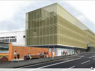
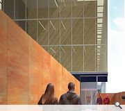
A second phase of work will see the existing premises extended and re-skinned using perforated anodized or bronzed aluminium mesh panels to give the ‘illusion of a veil set off from the solidity of the concrete frame’.
In a statement ZM said: “This second phase would define a new vision, a new venue and a fitting conclusion to the tours and a 'Statement of Pride' in the business. The gold mesh is a reference to the golden hue of the beer and Tennent’s own livery.”
First phase works including the visitor centre and improvements to the current tour experience are scheduled to complete next summer.
|
|
7 Comments
#1 Posted by Partick Bateman on 8 Dec 2016 at 15:33 PM
Looks like they've disguised it as the BBC building.
#2 Posted by YouCannotSwear on 8 Dec 2016 at 15:50 PM
I enjoy the correlation to the colour of their beer.
#3 Posted by Patrick Bateman on 8 Dec 2016 at 15:55 PM
ZM's early work was a little too new wave for my tastes, but when Sports came out in '83, I think they really came into their own, commercially and artistically. The whole design has a clear, crisp look, and a new sheen of consummate professionalism that really gives the songs a big boost. He's been compared to JM, but I think Zaha has a far more bitter, cynical sense of humour.
#4 Posted by Patrick Bateman on 8 Dec 2016 at 16:02 PM
Look at that subtle off-white colouring. The tasteful thickness of it. Oh my God, it even has a watermark!
#5 Posted by A Local Pleb on 13 Dec 2016 at 14:12 PM
Polishing a t**d comes to mind!
#6 Posted by Cateran on 15 Dec 2016 at 22:58 PM
Interesting chiffon shroud which could lend interest to a fairly bland street.
Shame they make boufin' beer though.
Shame they make boufin' beer though.
#7 Posted by Ewan McIntyre on 22 Dec 2016 at 14:56 PM
so whats is the building going to look like once they have taken the scaffolding and netting down?
Post your comments
Read previous: Brownfield Govanhill site earmarked for 46 homes
Back to December 2016
Like us on Facebook
Become a fan and share
News Archive
Search News
Features & Reports
For more information from the industry visit our Features & Reports section.


