Glasgow hotel conversion signals shift in occupier demand
October 14 2014
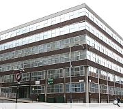
A redundant corner office block in Glasgow city centre is to be given a second lease of life as a hotel under plans submitted by 3DReid Architects for 199 West Regent Street.The sixties built West Regent House has been sans tenants since 2013 as occupiers increasingly favour new build properties within the city. As such the building has now been sold to Regent Street Hotels.
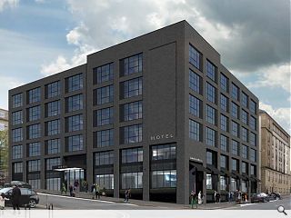
The new owners plan to strip existing facades from both West Regent Street and Pitt Street elevations to be replaced with a dark grey facing brick and full height aluminium framed windows. Rear facades will be merely refurbished and an east gable facing Blythswood Square painted black.
In their design statement 3DReid said; “The north and west elevations will be fully refurbished with new high quality dark grey facing brick with full height aluminium framed windows at the upper levels which will incorporate a black feature panel. The ground and first floor windows will be double height aluminium curtain walling to give the illusion of height to the street. This will be surrounded by a slim polished granite ‘picture’ frame with a matching stall riser below ground floor level. The ground floor windows will have a frit glass spandrel to further emphasise the illusion of height and a laser cut metal panel separating the first floor windows above.
“A decorative feature entrance with illuminated canopy defines the hotel entrance on West Regent Street whilst on Pitt Street awnings are provided over the windows to the bar/restaurant. Meanwhile a separate entrance to the bar/restaurant is set within a deep recess with decorative panelling and side awnings.”
19 Comments
#1 Posted by SJF on 14 Oct 2014 at 14:43 PM
Oh boy! They've really turned that into a bright, cheering and inviting building!
#2 Posted by james on 14 Oct 2014 at 16:06 PM
Literally breath-taking! Who are 3DReid? Are they Architects?
#3 Posted by Chris on 14 Oct 2014 at 16:49 PM
I like it, it's reminiscenct of Citizen M or the new housing block at Laurieston.
#4 Posted by Rem-Job on 15 Oct 2014 at 08:42 AM
If you have the arrogance to associate your practice with the term 3D you might want to be sure you are good at them......
#5 Posted by Art Vandelay on 15 Oct 2014 at 09:07 AM
I think this actually has a bit of potential. The image doesn't do it any favours, but if it's properly detailed then it could look quite slick.
#6 Posted by neil on 15 Oct 2014 at 10:59 AM
It's definitely an improvement on the "before" picture - but I can't help thinking a different colour of brick would make a huge difference. The current obsession with dark grey is really more suited to a much sunnier climate.
#7 Posted by Shabbadoo on 15 Oct 2014 at 11:47 AM
Shame about the windows and brick colour. Close but no cigar (choke choke).
#8 Posted by james on 15 Oct 2014 at 12:42 PM
Slick? OMG! It reminds me of the image of a 19th century dockside warehouse building in Portsmouth as illustrated in JM Richards' 1953 book 'an introduction to modern architecture'. The aesthetic of this is perverse. Visual 'load-bearing' brickwork 'cladding' stuck onto a framed 60's building. At least the original building had architectural integrity. This offering is merely graphic, dull and banal at that. Architects?
#9 Posted by the sultan of brooneye on 15 Oct 2014 at 13:09 PM
@James - clearly 3DReid are magicians! after all, it is all an illuuuuuussssssiooooonnnn. Says so in their design statement.
"The ground floor windows will have a frit glass spandrel to further emphasise the ILLUSION of height"
"The ground floor windows will have a frit glass spandrel to further emphasise the ILLUSION of height"
#10 Posted by Egbert on 15 Oct 2014 at 13:31 PM
Definitely one of the better hotel-overclad schemes - I've seen far, far worse than this. For the price of architectural/tectonic integrity Glasgow gains a decent, solid-looking corner building worthy of its place in the city centre grid - more than can be said for some of the new-builds nearby.
#11 Posted by Rem-Job on 15 Oct 2014 at 13:48 PM
Hoping for their next trick they start again........
#12 Posted by Sultan of Swing on 15 Oct 2014 at 13:58 PM
You negative lot really should be quiet or go and find the money to carry out your own developments if you care that much. The existing building is horrendous as are the some of the silly comments here. Clearly an improvement for the site and City. Go back to your Architecture books and stay there.
#13 Posted by Shabbadoo on 15 Oct 2014 at 14:59 PM
Theres too many Sultans!
#14 Posted by Rem-Job on 15 Oct 2014 at 15:24 PM
Swing, I have just been reading 3DReids manifesto 'A lifelong desire to give buildings greater vertical emphasis' here in architecture book corner. Fascinating ........
#15 Posted by Tenement Funster on 15 Oct 2014 at 16:20 PM
Certainly an improvement on existing. With the right texture of brick could be very pleasant.
#16 Posted by Ian Nairn Jr on 15 Oct 2014 at 19:24 PM
I like it. It's solid, and always good to see an existing building being re-used. There's plenty of brick in the area, with the old Pitt St police station across the road and the building (telephone exchange?) seen in the image above, on West George Street. It'll stand quite nicely in what is quite a utilitarian area anyway. It's a lot less flimsy than a lot we've seen in Glasgow. Make sure you get that brickwork detailing right 3Dreid!
#17 Posted by Shabbadoo on 16 Oct 2014 at 12:35 PM
Sultan of Swing. Dire Straits. Dire........
Now I get it!
Now I get it!
#18 Posted by That Guy on 16 Oct 2014 at 17:28 PM
First thing can we please make sure that the quality of the images presented on this forum matches the quality that they are currently at. In a way it diminishes the visual aspect of the design.
That being said, from what is presented, I do understand where they are coming from with this design. It's modern, cost effective, and quite pleasing for the planners. Simple, effective and in a way, settles in quite well with its context. The renderings however, do not sell the scheme. There is no life to them, no sell factor and no ambition to try and capture my interest. Maybe add some interactions within the internal spaces, more lights, make it busy so it looks like individuals are living there and using the building.
That being said, from what is presented, I do understand where they are coming from with this design. It's modern, cost effective, and quite pleasing for the planners. Simple, effective and in a way, settles in quite well with its context. The renderings however, do not sell the scheme. There is no life to them, no sell factor and no ambition to try and capture my interest. Maybe add some interactions within the internal spaces, more lights, make it busy so it looks like individuals are living there and using the building.
#19 Posted by Art Vandelay on 16 Oct 2014 at 20:48 PM
And a lens flare or two, they always look good.
I'm intrigued to see this black painted gable too.
I'm intrigued to see this black painted gable too.
Post your comments
Back to October 2014
Like us on Facebook
Become a fan and share
News Archive
Search News
Features & Reports
For more information from the industry visit our Features & Reports section.


