Stallan-Brand submit phase II Speirs Locks plan
October 3 2014
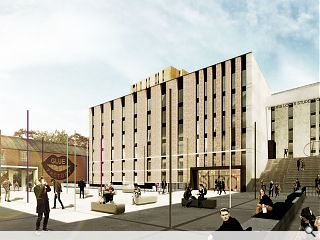
Stallan-Brand architects have submitted phase II proposals for their Speirs Locks master plan, outlining the delivery of two student blocks containing a further 304 beds.Clad in brick and corten steel in reference to the areas industrial aesthetic the blocks take the form of plinth and tower elements with gables given over to an urban canvas for the display of large super graphics.
Looking out over an arrival plaza, which will double as an outdoor amenity for the adjacent Glue Factory and Whisky Bond arts venue, the scheme aims to deliver the ‘best urban space in Glasgow’.
In their design statement Stallan-Brand said: “The East Elevation of Block A adds a scale and sense of enclosure which was lacking in the initial Phase I application information, and creates a tiered residential scaled environment very similar to the original tenemental scaled streets of Garscube Road to which it sits parallel.
“The rectangular form and lineal nature of the space is given necessary relief at key points by the location of the arrival plaza at its southernmost point. The street visually leads the user along the length of the two opposing elevations and focuses them upon the intriguing arched brickwork and large-scale contemporary sculpture located close to the building’s primary entrances.”

The architects aim to placed as much emphasis on the spaces between buildings as the buildings themselves
|
20 Comments
#2 Posted by SJF on 3 Oct 2014 at 11:44 AM
If their going to put as much effort into the space between the buildings as they have the buildings, god help the space!
#3 Posted by Rabbie on 3 Oct 2014 at 12:08 PM
What a drab and uninviting design. I'll take the Fountainbridge development instead, ta.
#4 Posted by james on 3 Oct 2014 at 12:58 PM
The end of modernism is nigh; again. They demolished this stuff in the 70's. Banal facades dressed up as barcodes. Groovy! But wait! I get it now! It's the hotel extension in front of Queen Street Station demolished and re-built at Speirs Locks. How's that for sustainability! Get in there!
#5 Posted by The Reekin Lum on 3 Oct 2014 at 14:13 PM
Sorry Stallan Brand, but what a miserable design. A totally out of scale brick cliff face and a totally uninspiring space with no real ground level frontages. Drab windtunnels between overscaled blocks, creating long and damp corridors - with steps! Everything that was terrible about architecture in the 70's, just not in the 70s.
#6 Posted by Hans Frei on 6 Oct 2014 at 09:56 AM
What in god's name is supposed to be going on in the third image?
#7 Posted by Brian on 6 Oct 2014 at 10:13 AM
I know its unique to Scotland with all the arts etc in the city,But this has to be changed its like a prison exercise yard,Not that ive ever been in one.
#8 Posted by Big Chantelle on 6 Oct 2014 at 21:56 PM
Ah, modernism rears its ugly head yet again.
I suppose the people in the arrival-plaza-event-squarey thing are meant to be in awe of the stripped aesthetic of the building frontages. The reality is they'll be screwing their faces up and thinking "this place makes Cumbernauld shopping centre look amazing".
And as for those bohemian-hipster types sitting on rugs in the middle of the tarmac expanse listening to their edgy music no-one has heard of -- aye, that'll be happening in WET Glesga.
#9 Posted by Morley on 7 Oct 2014 at 09:07 AM
Do you ever get the feeling that these guys are taking the **** with their images of people ?
#10 Posted by Walt Disney on 7 Oct 2014 at 13:26 PM
Defo a drug deal going on in image 3. The design is obviously inspired by the space between the Architecture building and the Colville building at Strathers. A beautiful windswept and uninhabited piece of concrete.
#11 Posted by Matthew Ansell on 7 Oct 2014 at 13:41 PM
Ah, the Big obtuse troll rears its ugly head yet again.....
...and add absolutely nothing to the debate...is there any other website you can populate with your unrelenting, negative drivel?.
...and add absolutely nothing to the debate...is there any other website you can populate with your unrelenting, negative drivel?.
#12 Posted by Neil C on 7 Oct 2014 at 14:07 PM
Hey.........hands off Big Chantelle. She may be a troll but she's OUR troll
#13 Posted by A Local Pleb on 7 Oct 2014 at 14:52 PM
C'mon Stallan Brand you can do a lot better than this...bland, drab, boring...looks as bad as the De Vere Village Hotel brand that is springing up everywhere!
#14 Posted by Big Chantelle on 7 Oct 2014 at 14:59 PM
@Matthew Ansell
I'm a troll? For what, expressing opinions on architecture? Who or what am I trolling -- bricks, white render, zinc cladding? Am I not allowed to express an opinion -- like yourself may I add -- on these things?
It speaks volumes that out of all the mainly negative comments here, you single out my one. Guess you trolled through the comments just to unfairly criticise me. Thought so.
I don't have to be positive on the architectural proposals -- it's called an opinion. You may be in love with the designs. I am not.
Regards.
#15 Posted by Hans Frei on 7 Oct 2014 at 15:08 PM
The two elderly hipsters in image three may well be conducting a drug deal, but at least the building accommodates the use of alternative methods of transport such as flying carpets.
#16 Posted by David on 7 Oct 2014 at 15:16 PM
Matthew,
Unless you have something personal against her, or work for Stallan Brand, please only criticise Big Chantelle when it is justified (which granted is a lot of the time).
She's spot on this time, as seems to be the predominant opinion above so far.
Unless you have something personal against her, or work for Stallan Brand, please only criticise Big Chantelle when it is justified (which granted is a lot of the time).
She's spot on this time, as seems to be the predominant opinion above so far.
#17 Posted by Rem-Job on 7 Oct 2014 at 15:30 PM
Yeah Ansell, Big C is bringing the opinion to the table. You offer very little except negativity and spite. On a lighter note, I hate this scheme and I hope it never gets built......ever
#18 Posted by Matthew Ansell on 7 Oct 2014 at 17:19 PM
David- Agreed, the majority of opinions are fairly negative…that is obvious and I can’t say I enjoyed the images either. I would hardly classify his/her commentary as ‘spot on’ though!!
My specific criticism of ‘Big Chanter’s’ relates to the tiresome, shouty generalisations and sweeping statements about modernism, usually with ‘Brigade’ on the end….posted over and over from the safety of his/her pseudonym…wouldn’t we all like to know who is behind the name and what sort of ground breaking work they do!
Lobbing a few stones is easy when no one can see you do it eh?
I didn’t feel the need to criticise the others as I either agree with them or they made me laff….
Ciao
Matthew_ Not Stallan Brand
#19 Posted by the sultan of brooneye on 7 Oct 2014 at 21:40 PM
Image 1: Entrepreneurial glue-sniffers set up factory next to student junkie village.
Image 2: 'mega-ice-fart' wins degree show prize.
Image 3: Cellist steps in "Scheisse"
That said; I think that whatever space and time mean, place and occasion mean more. Surely you agree?
Image 2: 'mega-ice-fart' wins degree show prize.
Image 3: Cellist steps in "Scheisse"
That said; I think that whatever space and time mean, place and occasion mean more. Surely you agree?
#20 Posted by Stephen on 9 Oct 2014 at 23:51 PM
@ Chantelle no.14. You ARE a troll. It's not your dislike of Modernism or negative reaction to stories that gets to people (not that you appear to understand what Modernism is). It's the unending pigeon-holing of more or less everyone else as a 'lefty' or the 'modernist-brigade' both used in the sneering pejorative. You should apply for a job with Fox News.
Post your comments
Read next: New Town youth hostel opens its doors
Read previous: Ailteir-Studio deliver Bearsden home extension
Back to October 2014
Like us on Facebook
Become a fan and share
News Archive
Search News
Features & Reports
For more information from the industry visit our Features & Reports section.


got to love the guff in a design statement