Rebrand cements foundations for growth
November 24 2008
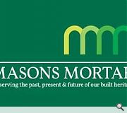
Edinburgh based Masons Mortar Ltd has unveiled their striking new identity. Created by corporate branding specialists Glidden Design the new look aims to reflect more accurately the company’s expertise in traditional and modern building materials, professionalism, quality and ambitious business plans.The rebrand also supports the company’s client care ethos, which will challenge preconceptions about customer service in the provision of building supplies.
Masons Mortar, which was founded with the aim of reviving the use of lime in Scotland, has grown to be the country’s leading provider of lime mortars since it was established in 1989.
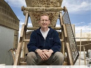
Drawing on his background in retail management, Stuart has overseen investment in product development, expanding the range, promoting lime based materials for new build applications and introducing practical skills training and complimentary consultations.
Stuart said: “My father founded Masons Mortar with a passion for preserving Scotland’s built heritage and achieving sustainability through the increased use of lime mortars.
“We have built on this ethos by providing our customers with a comprehensive range of user friendly materials, making the widespread use of lime more accessible.
“Customers can call us literally trowel in hand and receive good practical advice.”
Director Andrew Glidden was coincidentally a one-off customer of Masons Mortar before he and Stuart were later introduced through business networking. He revealed his experience as a customer was in synergy with the commitment to education, service and product quality which was to underpin the design brief.
Andy said: “Our aim was to create an identity which had multiple layers of interest and could be interpreted in a number of different ways, all aligned with the brand values identified in the first stage of our work with Stuart and his team. The contemporary aspect of the business is reflected in the symbol, which can be seen as two initial ‘Ms’ joined together, alternatively as an architectural building reference such as a colonnade.
“The palette of greens is a reference to progression and development, while also hinting at the environmental benefits of working with lime. The Masons Mortar typography provides a classical counterpoint to reflect the use of lime in traditional building. Crucially, the branding captures the big idea of combining past, present and future.”
The branding process took place over three months and the results are being implemented across a range of marketing platforms, including communications materials, signage, staff uniforms and delivery vehicles.
Stuart said: “We are thrilled to present a stunning rebrand which captures the essence of Masons Mortar, our passion for preserving the past, present and future of our built heritage.”
For further information visit www.masonsmortar.co.uk and www.gliddendesign.com
Read next: Michael Laird make waves at Waverley Gate
Read previous: Kalzip call Teamkal awards 2008
Back to November 2008
Like us on Facebook
Become a fan and share
News Archive
Search News
Features & Reports
For more information from the industry visit our Features & Reports section.


